Case study · Founding client
Keely + Co.
She had the gift, the warmth and the dream — a planner who pours the champagne and quietly runs the night. What she didn’t have was a website. So she handed me the vision, and I built the home for it: a site made to feel unmistakably like her, and to draw the women she most wants to work with.
Bringing visions to life — starting with her own.
- Role
- Web & design
- Year
- 2025
- Built
- By hand
- Status
- Founding client
Keely + Co., as it shipsWarm · plush · unmistakably hers
Part one
The brief
Keely knew exactly who she was. The work was to give that a place to live, and a door the right person would want to walk through.
A full heart, and no front door.
A dream with nowhere to send people
Keely knew exactly who she was. She just had nowhere to send people.
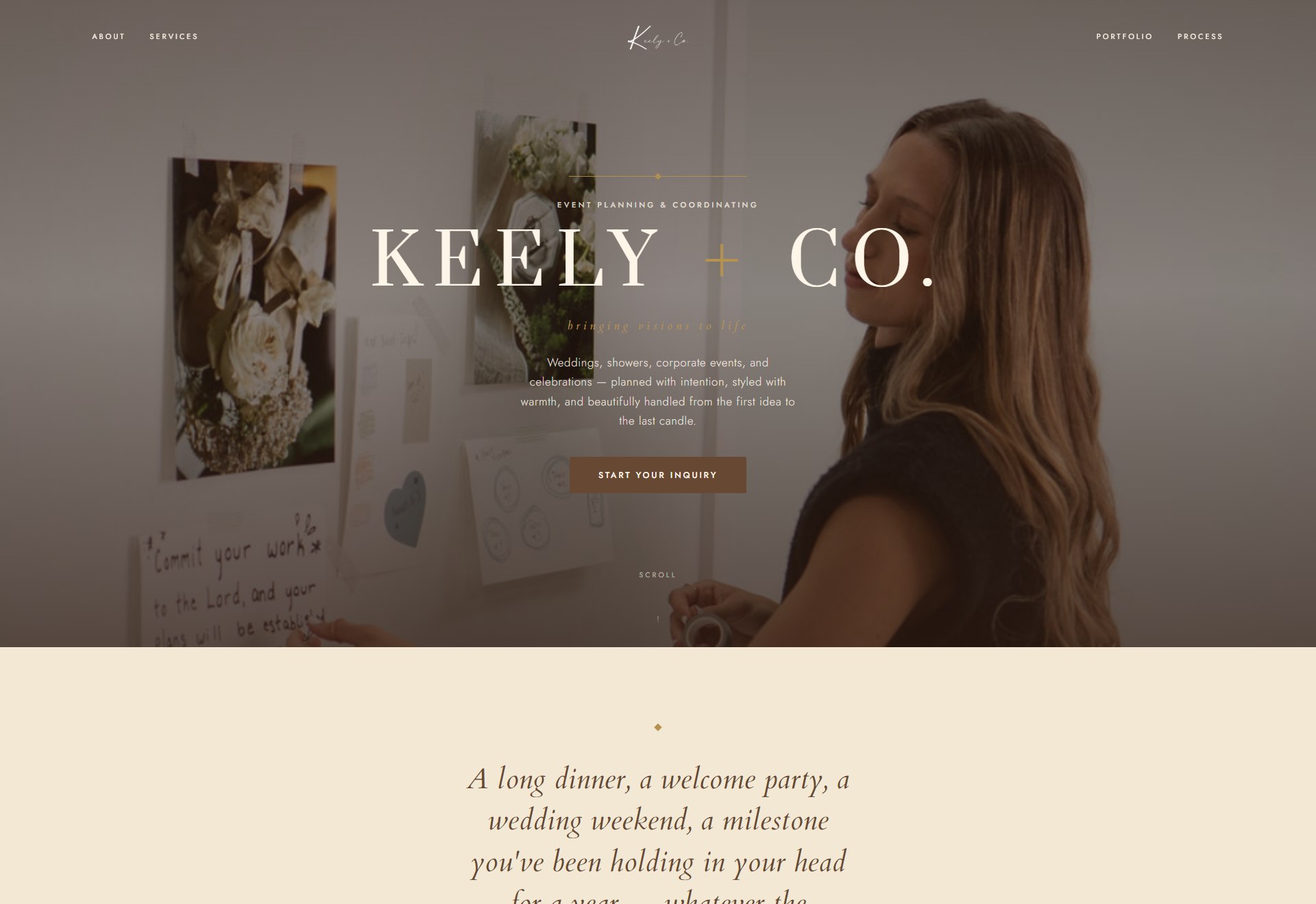
Keely is the planner every bride hopes she gets — the one who understands what you mean before you can put it into words, who pours the champagne and quietly runs the night. She had the gift, a name she loved, and a voice already warm in her head. What she didn’t have was a website. Not a thin one, not a dated one — none. The people who adored her in person had no way to feel any of that before they met her, so everything lived on referrals and word of mouth. My job was never to fix a site. It was to take the dream she described and build the front door it had never had.
Built backward from the inquiry.
Make her feel held, then make the next step easy
The goal was never traffic. It was the right woman not wanting to leave.
A planner like Keely doesn’t need a crowd; she needs the right person to land, feel understood, and reach out. So the site is built backward from that one inquiry, and it answers in the order a real person feels things: first the warmth (this is for me), then the proof (she’s done this, she’s safe to trust), then the ask (here’s how we start). Emotional first, conversion second, and professional enough the whole way that she’d feel proud to be recommended. Pretty was never the point. Being unmistakably hers was.
The words were already warm. The design just had to catch up.
Part two
Warming the room
This is the part she feels in the first second, mostly without knowing why. The job was to keep every bit of the discipline and raise the temperature.
Keep the discipline. Raise the heat.
Soften the editorial edges into hospitality
My first pass was beautiful, and a little cold. Her brand wasn’t.
I started where luxury usually starts: editorial and precise — hairline borders, near-square corners, wide-tracked capitals, cool shadows. It photographed well and held you at arm’s length. But Keely’s words are the opposite of arm’s length — “so glad you’re here,” “calm hands, full heart.” The design and the voice were speaking two different temperatures. So the whole second pass had one instruction: keep every bit of the discipline, and raise the warmth. Soften the editorial edges into something plush and hand-made, without ever tipping into sweet. The grid, the restraint and the gold all stay; the temperature climbs.
An accent hiding in the error styles.
Warm neutrals, a little gold, a blush that started as a mistake
The best accent on the site was hiding in the error colour.
The base is a set of warm, expensive neutrals — ivory and cream that step back so her own photographs carry the colour. Champagne gold does the quiet luxury, used only where it earns it. The surprise was the blush: the brand’s dusty rose had only ever been used as an error colour, sitting unloved in the system. I promoted it to a tender decorative accent — low-alpha tints only, never a fill — and suddenly the site had a feminine warmth that read as hers without ever going pink. A colour nobody wanted became the softest touch on the page.
A logo I had to scan pixel by pixel.
Her name, set by hand, not typed
The wordmark went the long way round to land on the simplest answer.
The type pairs a high-contrast display serif (Prata) for the headlines with a literary italic (Cardo) for the warm asides and a calm geometric sans (Jost) for the body — and I eased the widest letter-spacing in, so the capitals read intimate rather than corporate. The wordmark took the longest. It went through a real exploration — big serif caps, her own logo file, a flowing script, a clean sans, and back — before landing on the truest answer: KEELY in ivory, + CO. in champagne gold. The catch: her logo is a flattened image, un-recolourable in parts. So I scanned its pixels on a canvas to find the exact transparent gap between the words (58.9% across) and tinted the original artwork in two tones from there — her real logo, now two-coloured, with its strokes untouched.
Behind the visible wordmark sits an invisible headline — “Gatherings that feel unmistakably yours” — so a search engine reads the keywords while a visitor reads the brand. And the very last line on the page is set in a flowing script: Let’s make it feel like you.
The closing line is set in a flowing script (Dancing Script) on the live site.
Warmth lives in the edges.
Softer corners, a warmer shadow, a whisper of paper
None of the warmth is a costume. It’s all in the details that touch you quietly.
The warmth lives in the things that reach you without announcing themselves. Corners that were near-square (2 to 4px) were rounded to a held-feeling 4 to 10px, so every button, card and photo frame eased off. The shadows were re-tinted from a cool near-black to a warm khaki-brown and spread softer, so cards rest on the page instead of floating on glass. A barely-there paper grain sits over the light surfaces for a café-stationery texture, and the hero scrim was warmed and thinned so far more of her photograph breathes through. Her candid photos are matted like printed snapshots — a warm white border, a soft shadow, a slight hand-placed tilt — so they feel set on the page, not stamped into it.
Everything settles. Nothing slides.
Part three
How it moves & talks
If the look is how the site dresses, this is how it carries itself and how it speaks. Both should feel like her in the room with you.
Set, like a place card.
Things arrive the way you’d set a table
Nothing whooshes. Everything settles.
The whole site glides on a premium smooth-scroll, tuned by feel and switched off entirely for anyone who asks for less motion. As you move down the page, elements don’t slide in from the side — they settle into place, the way you’d set a place card at a table. The signature is a small gold seal: a divider line draws out from its centre, and a beat later a gold diamond settles onto it, closing each moment like a stamp. It’s the one flourish that earns its keep, so it’s the only one I kept.
The contrast math is the craft.
The one button the whole site is built to earn
Ivory on gold looks lovely and fails the eye test. So it never ships.
Inquire is the promise the whole site is built to earn, so it stays a real, stationary button no matter what section sits behind it — brown fill, ivory text, gently rounded. The interesting part is the hover. The obvious move is ivory text on a gold fill, but that pairing only reaches about 2.5:1 contrast — under the line where text stays comfortably legible. So on hover the button fills gold and the text drops to espresso, which lands near 5.9:1 and clears it cleanly. Same warm gold moment, text you can actually read. That little calculation is the difference between decoration and design.
The way she’d ask in person.
Talk like the friend who’s already on your side
A form can ask “event type.” Or it can ask what you’re celebrating.
The copy is first-person and warm, because she is. The place it matters most is the form, where most sites turn cold and clinical. Hers asks the way she would in person — “What are we celebrating?”, “When’s the gathering?”, “How did you find me?” — and the note after you send reads, “Thank you for trusting me with this. I read every word myself.” The service pages got the same care: written to feel authored rather than pasted, with a styled “best if” note and clearer ways to work together.
Event type
Event date
Referral source
Submit
Asks like a database.
What are we celebrating?
When’s the gathering?
How did you find me?
Send
“I read every word myself.”
Part four
The finishing
The last and hardest part of taste: knowing what to take away, and refusing to fake what isn’t there yet.
Knowing what to leave out.
The taste to leave things out
The last pass was almost all subtraction.
The final pass was mostly taking things away. Of all the small gold diamonds scattered through the early drafts, exactly one survived — the seal centred on its rule — and the rest of the little marks were pared back to the thinnest gold dashes. Nothing on the site is borrowed or invented: no stock awards, no imagined press, no numbers I can’t stand behind, so the testimonials sit honestly empty until her real clients speak. And the whole thing stays kind to whoever lands on it, with room to breathe and motion that settles into stillness for anyone who asks for less. Taste, in the end, is mostly knowing what to take away.
- Restraint as polish — every decorative diamond removed but the one that earns it; the rest pared back to the thinnest gold dashes.
- Nothing borrowed or faked — no invented press, no stock awards, no numbers I can’t stand behind; the testimonials wait, honestly, for her real clients.
- Kind to everyone — described images, real structure, a clear focus ring, and motion that settles the moment someone asks for less.
What it’s built to do
It feels like her
I won’t hand you numbers a brand-new site hasn’t earned — that’s a studio rule, and it bites hardest on the projects I’m proudest of. What I can tell you is that Keely now has the thing she didn’t before: a front door that feels exactly like stepping into her world. Warm, composed, unmistakably hers, and built so the right woman lands, feels held, and reaches out. The dream had a voice. Now it has a home.
Want one that feels like you?
If you’ve got the vision and no website to carry it — or one that doesn’t sound like you — that’s exactly the gap I close. Founding-client builds start at $2,000, and I read every enquiry myself, usually within about two days.